Qt Quick 2 Bars Example
Using Bars3D in a QML application.
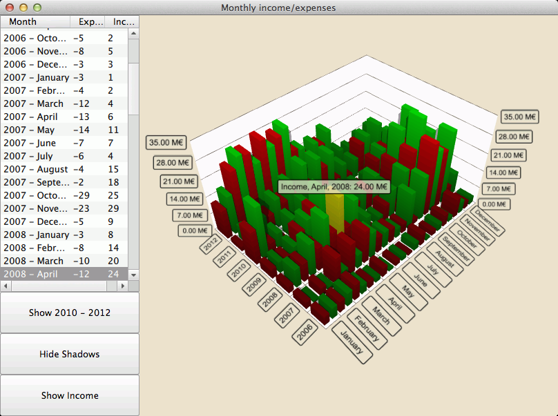
The Qt Quick 2 bars example shows how to make a simple 3D bar graph using Bars3D and Qt Quick 2.
The interesting thing about this example is switching series and displaying more than one series at once. We'll concentrate on those and skip explaining the basic Bars3D functionality - for more detailed QML example documentation, see Qt Quick 2 Scatter Example.
Running the Example
To run the example from Qt Creator, open the Welcome mode and select the example from Examples. For more information, visit Building and Running an Example.
Data
The example data is monthly income and expenses of a fictional company over several years. The data is defined in a list model in Data.qml like this:
 ListModel {
     id: dataModel
     ListElement{ timestamp: "2006-01"; expenses: "-4";  income: "5" }
     ListElement{ timestamp: "2006-02"; expenses: "-5";  income: "6" }
     ListElement{ timestamp: "2006-03"; expenses: "-7";  income: "4" }
     ...
Each data item has three roles: timestamp, income, and expenses. The timestamp value is in format: <four digit year>-<two digit month>. Years and months are natural to map to rows and columns of a bar chart, but we can only show either income or expenses as the value.
Now we need to add the data to the Bars3D graph. We will create two Bar3DSeries inside it, starting with a series for the income:
 Bar3DSeries {
     id: barSeries
     itemLabelFormat: "Income, @colLabel, @rowLabel: @valueLabel"
     baseGradient: barGradient

     ItemModelBarDataProxy {
         id: modelProxy
         itemModel: graphData.model
         rowRole: "timestamp"
         columnRole: "timestamp"
         valueRole: "income"
         rowRolePattern: /^(\d\d\d\d).*$/
         columnRolePattern: /^.*-(\d\d)$/
         rowRoleReplace: "\\1"
         columnRoleReplace: "\\1"
         multiMatchBehavior: ItemModelBarDataProxy.MMBCumulative
     }
     ...
The data is attached to the itemModel property of the ItemModelBarDataProxy inside the series. For valueRole we simply specify the income field, as it contains the value we want, but getting the years and months is a bit more complicated, since they are both found in the same field. To extract those values, we specify the timestamp field for both rowRole and columnRole, and additionally specify a search pattern and a replace rule for those roles to extract the correct portion of the field contents for each role. The search pattern is a normal JavaScript regular expression and the replace rule specifies what the field content that matches the regular expression is replaced with. In this case we want to replace the entire field content with just the year or the month, which is the first captured substring for both rows and columns. For more information how the replace using regular expressions works, see QString::replace(const QRegExp &rx, const QString &after) function documentation.
The multiMatchBehavior property specifies what to do in case multiple item model items match the same row/column combination. In this case we want to add their values together. This property has no effect when we are showing values for each month, as there are no duplicate months in our item model, but it becomes relevant later when we want to show the yearly totals.
Then we add another series for the expenses:
 Bar3DSeries {
     id: secondarySeries
     visible: false
     itemLabelFormat: "Expenses, @colLabel, @rowLabel: -@valueLabel"
     baseGradient: secondaryGradient

     ItemModelBarDataProxy {
         id: secondaryProxy
         itemModel: graphData.model
         rowRole: "timestamp"
         columnRole: "timestamp"
         valueRole: "expenses"
         rowRolePattern: /^(\d\d\d\d).*$/
         columnRolePattern: /^.*-(\d\d)$/
         valueRolePattern: /-/
         rowRoleReplace: "\\1"
         columnRoleReplace: "\\1"
         multiMatchBehavior: ItemModelBarDataProxy.MMBCumulative
     }
     ...
The model contains expenses as negative values, but we want to show them as positive bars, so that we can easily compare them to income bars. We use valueRolePattern to remove the minus sign to achieve this. No replacement string needs to be specified as the default replacement is an empty string.
We use the visible property of the series to hide the second series for now.
Custom Axis Labels
One interesting tidbit about axes is that we redefine the category labels for column axis in Axes.qml. This is done because the data contains numbers for months, which we don't want to use for our column labels:
 CategoryAxis3D {
     id: columnAxis
     labels: ["January", "February", "March", "April", "May", "June",
         "July", "August", "September", "October", "November", "December"]
     labelAutoRotation: 30
 }
We also set automatic axis label rotation to make axis labels more readable at low camera angles.
Switching Series
In the main.qml, we set up the graph and various UI elements. There are three interesting code blocks we want to highlight here. The first one shows how to change the visualized data between income, expenses, and both, by simply changing visibility of the two series:
 onClicked: {
     if (text === "Show Expenses") {
         barSeries.visible = false
         secondarySeries.visible = true
         barGraph.valueAxis.labelFormat = "-%.2f M\u20AC"
         secondarySeries.itemLabelFormat = "Expenses, @colLabel, @rowLabel: @valueLabel"
         text = "Show Both"
     } else if (text === "Show Both") {
         barSeries.visible = true
         barGraph.valueAxis.labelFormat = "%.2f M\u20AC"
         secondarySeries.itemLabelFormat = "Expenses, @colLabel, @rowLabel: -@valueLabel"
         text = "Show Income"
     } else { // text === "Show Income"
         secondarySeries.visible = false
         text = "Show Expenses"
     }
 }
The axis label format and item selection label formats are tweaked to get the negative sign showing properly for expenses, which were actually resolved as positive values.
The second interesting block is where we change the visualized data by adjusting the proxy propertes:
 onClicked: {
     if (text === "Show yearly totals") {
         modelProxy.autoRowCategories = true
         secondaryProxy.autoRowCategories = true
         modelProxy.columnRolePattern = /^.*$/
         secondaryProxy.columnRolePattern = /^.*$/
         graphAxes.value.autoAdjustRange = true
         barGraph.columnAxis = graphAxes.total
         text = "Show all years"
     } else if (text === "Show all years") {
         modelProxy.autoRowCategories = true
         secondaryProxy.autoRowCategories = true
         modelProxy.columnRolePattern = /^.*-(\d\d)$/
         secondaryProxy.columnRolePattern = /^.*-(\d\d)$/
         graphAxes.value.min = 0
         graphAxes.value.max = 35
         barGraph.columnAxis = graphAxes.column
         text = "Show 2010 - 2012"
     } else { // text === "Show 2010 - 2012"
         // Explicitly defining row categories, since we do not want to show data for
         // all years in the model, just for the selected ones.
         modelProxy.autoRowCategories = false
         secondaryProxy.autoRowCategories = false
         modelProxy.rowCategories = ["2010", "2011", "2012"]
         secondaryProxy.rowCategories = ["2010", "2011", "2012"]
         text = "Show yearly totals"
     }
 }
To show yearly totals, we need to combine the twelve months of each year into a single bar. We achieve this by specifying a columnRolePattern that matches all model items. That way the data proxy will only have a single column. The cumulative multiMatchBehavior we specified earlier for the proxy becomes relevant now, causing the values of all twelve months of each year to be added up into a single bar.
To show just a subset of years, we set autoRowCategories to false on the ItemModelBarDataProxy item and define the row categories explicitly. This way, only the items in specified row categories are visualized.
The third interesting block shows how to get the row and column index of an item if you know the row and column values by using ItemModelBarDataProxy methods rowCategoryIndex() and columnCategoryIndex():
 onCurrentRowChanged: {
     var timestamp = graphData.model.get(currentRow).timestamp
     var pattern = /(\d\d\d\d)-(\d\d)/
     var matches = pattern.exec(timestamp)
     var rowIndex = modelProxy.rowCategoryIndex(matches[1])
     var colIndex
     if (barGraph.columnAxis === graphAxes.total)
         colIndex = 0 // Just one column when showing yearly totals
     else
         colIndex = modelProxy.columnCategoryIndex(matches[2])
     if (selectedSeries.visible)
         mainview.selectedSeries.selectedBar = Qt.point(rowIndex, colIndex)
     else if (barSeries.visible)
         barSeries.selectedBar = Qt.point(rowIndex, colIndex)
     else
         secondarySeries.selectedBar = Qt.point(rowIndex, colIndex)
 }