PercentBarChart Example
The example shows how to create a simple percent bar chart.
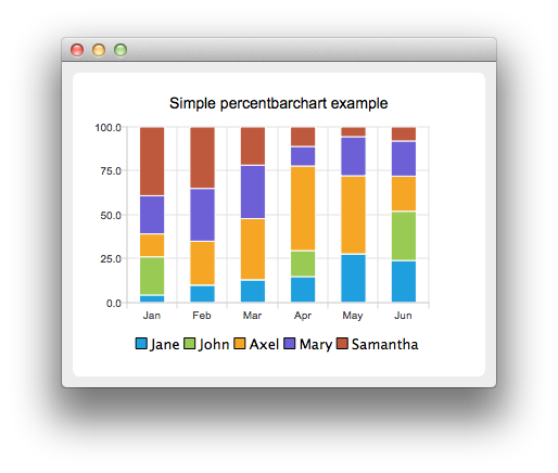
A percent bar chart shows the data in sets as a percentage of all sets per category.
Creating percent bar charts is just like creating a regular bar chart, except that for a percent bar charts, we use the QPercentBarSeries api instead of QBarSeries. Also, in the bar chart we used the nice numbers algorithm to make the y-axis numbering look better. With the percent bar chart there is no need for that, because the maximum y-axis value is always 100.
Running the Example
To run the example from Qt Creator, open the Welcome mode and select the example from Examples. For more information, visit Building and Running an Example.
Creating Percent Bar Charts
The barsets are used in same way in all barcharts. To illustrate the difference between various barcharts, we use the same data in all examples. The data visualized by the bar chart is defined by QBarSet instances. Here we create the sets and append data to them. The data is appended here with the << operator. Alternatively the append method could be used.
     QBarSet *set0 = new QBarSet("Jane");
     QBarSet *set1 = new QBarSet("John");
     QBarSet *set2 = new QBarSet("Axel");
     QBarSet *set3 = new QBarSet("Mary");
     QBarSet *set4 = new QBarSet("Samantha");

     *set0 << 1 << 2 << 3 << 4 << 5 << 6;
     *set1 << 5 << 0 << 0 << 4 << 0 << 7;
     *set2 << 3 << 5 << 8 << 13 << 8 << 5;
     *set3 << 5 << 6 << 7 << 3 << 4 << 5;
     *set4 << 9 << 7 << 5 << 3 << 1 << 2;
We create the series and append the barsets to it. The series takes ownership of the barsets. The series groups the data from sets to categories. The first values of each set are grouped together in the first category, the second values in the second category etc.
     QPercentBarSeries *series = new QPercentBarSeries();
     series->append(set0);
     series->append(set1);
     series->append(set2);
     series->append(set3);
     series->append(set4);
Here we create the chart object and add the series to it. We set the title of the chart with setTitle, and then turn on animations of the series by calling setAnimationOptions(QChart::SeriesAnimations)
     QChart *chart = new QChart();
     chart->addSeries(series);
     chart->setTitle("Simple percentbarchart example");
     chart->setAnimationOptions(QChart::SeriesAnimations);
To have the categories displayed on an axis, we need to create a QBarCategoryAxis first. Here we create a category axis with a list of categories and add it to the chart aligned to the bottom, acting as the x-axis. The chart takes ownership of the axis. For y-axis we use a value axis, aligned to the left-hand side.
     QStringList categories;
     categories << "Jan" << "Feb" << "Mar" << "Apr" << "May" << "Jun";
     QBarCategoryAxis *axisX = new QBarCategoryAxis();
     axisX->append(categories);
     chart->addAxis(axisX, Qt::AlignBottom);
     series->attachAxis(axisX);
     QValueAxis *axisY = new QValueAxis();
     chart->addAxis(axisY, Qt::AlignLeft);
     series->attachAxis(axisY);
We also want to show the legend. To do so, we get the legend pointer from the chart and set it to visible. We also place the legend to bottom of the chart by setting its alignment to Qt::AlignBottom.
     chart->legend()->setVisible(true);
     chart->legend()->setAlignment(Qt::AlignBottom);
Finally we add the chart onto a view. We also turn on the antialiasing for the chartView.
     QChartView *chartView = new QChartView(chart);
     chartView->setRenderHint(QPainter::Antialiasing);
The chart is ready to be shown. We set the chart to be central widget of the window. We also set the size for the chart window and show it.
     QMainWindow window;
     window.setCentralWidget(chartView);
     window.resize(420, 300);
     window.show();