Line and BarChart Example
The example shows how to combine different charts and set the axes.
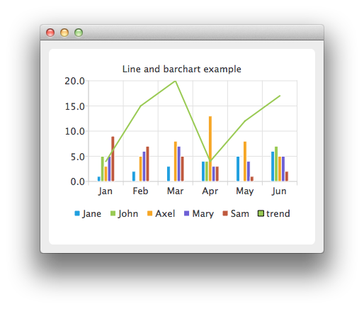
In the example we combine a linechart with a barchart and use the category axis as a common axis for both.
Running the Example
To run the example from Qt Creator, open the Welcome mode and select the example from Examples. For more information, visit Building and Running an Example.
Combining Charts
Here we create data for our bar series.
     QBarSet *set0 = new QBarSet("Jane");
     QBarSet *set1 = new QBarSet("John");
     QBarSet *set2 = new QBarSet("Axel");
     QBarSet *set3 = new QBarSet("Mary");
     QBarSet *set4 = new QBarSet("Sam");

     *set0 << 1 << 2 << 3 << 4 << 5 << 6;
     *set1 << 5 << 0 << 0 << 4 << 0 << 7;
     *set2 << 3 << 5 << 8 << 13 << 8 << 5;
     *set3 << 5 << 6 << 7 << 3 << 4 << 5;
     *set4 << 9 << 7 << 5 << 3 << 1 << 2;
We create a bar series and append sets to it. The first values of each set are grouped together in the first category, the second values in the second category and so on.
     QBarSeries *barseries = new QBarSeries();
     barseries->append(set0);
     barseries->append(set1);
     barseries->append(set2);
     barseries->append(set3);
     barseries->append(set4);
Then we create a line series and add data to it. To make the data match with the barchart, we use the index as an x-value for our line series, so that first point is at (0,value) second at (1,value) and so on.
     QLineSeries *lineseries = new QLineSeries();
     lineseries->setName("trend");
     lineseries->append(QPoint(0, 4));
     lineseries->append(QPoint(1, 15));
     lineseries->append(QPoint(2, 20));
     lineseries->append(QPoint(3, 4));
     lineseries->append(QPoint(4, 12));
     lineseries->append(QPoint(5, 17));
Here we create the chart and add both series to it.
     QChart *chart = new QChart();
     chart->addSeries(barseries);
     chart->addSeries(lineseries);
     chart->setTitle("Line and barchart example");
To make the chart show the series properly, we have to create custom axes for the series. If we don't create custom axes, then each series will get scaled to use the maximum area of the chart (like in single series case) and the result will be incorrect. With custom axes we set the range of both series to follow the same axis. For the x-axis we use the QBarCategoryAxis and for the y-axis we use QValuesAxis.
     QStringList categories;
     categories << "Jan" << "Feb" << "Mar" << "Apr" << "May" << "Jun";
     QBarCategoryAxis *axisX = new QBarCategoryAxis();
     axisX->append(categories);
     chart->addAxis(axisX, Qt::AlignBottom);
     lineseries->attachAxis(axisX);
     barseries->attachAxis(axisX);
     axisX->setRange(QString("Jan"), QString("Jun"));

     QValueAxis *axisY = new QValueAxis();
     chart->addAxis(axisY, Qt::AlignLeft);
     lineseries->attachAxis(axisY);
     barseries->attachAxis(axisY);
     axisY->setRange(0, 20);
And we also want to show the legend.
     chart->legend()->setVisible(true);
     chart->legend()->setAlignment(Qt::AlignBottom);
Finally we add the chart onto a view.
     QChartView *chartView = new QChartView(chart);
     chartView->setRenderHint(QPainter::Antialiasing);
Now it is ready to be shown in a window.
     QMainWindow window;
     window.setCentralWidget(chartView);
     window.resize(440, 300);
     window.show();