Pad Navigator Example
Demonstrates how to create animated user interface.
The Pad Navigator Example shows how you can use Graphics View together with embedded widgets and Qt's state machine framework to create a simple but useful, dynamic, animated user interface.
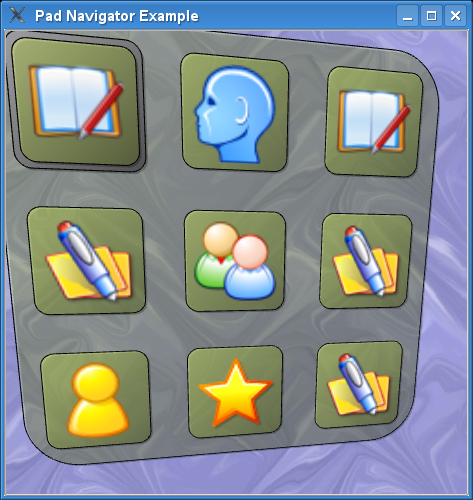
The interface consists of a flippable, rotating pad with icons that can be selected using the arrow keys on your keyboard or keypad. Pressing enter will flip the pad around and reveal its back side, which has a form embedded into a QGraphicsProxyWidget. You can interact with the form, and press the enter key to flip back to the front side of the pad at any time.
Graphics View provides the QGraphicsScene class for managing and interacting with a large number of custom-made 2D graphical items derived from the QGraphicsItem class, and a QGraphicsView widget for visualizing the items, with support for zooming and rotation.
This example consists of a RoundRectItem class, a FlippablePad class, a PadNavigator class, a SplashItem class, and a main() function.
RoundRectItem Class Definition
The RoundRectItem class is used by itself to display the icons on the pad, and as a base class for FlippablePad, the class for the pad itself. The role of the class is to paint a round rectangle of a specified size and gradient color, and optionally to paint a pixmap icon on top. To support FlippablePad it also allows filling its contents with a plain window background color.
Let's start by reviewing the RoundRectItem class declaration.
 class RoundRectItem : public QGraphicsObject
 {
     Q_OBJECT
     Q_PROPERTY(bool fill READ fill WRITE setFill)
 public:
     RoundRectItem(const QRectF &bounds, const QColor &color,
                   QGraphicsItem *parent = nullptr);

     QPixmap pixmap() const;
     void setPixmap(const QPixmap &pixmap);

     QRectF boundingRect() const override;
     void paint(QPainter *painter, const QStyleOptionGraphicsItem *option, QWidget *widget = nullptr) override;

     bool fill() const;
     void setFill(bool fill);
RoundRectItem inherits QGraphicsObject, which makes it easy to control its properties using QPropertyAnimation. Its constructor takes a rectangle to determine its bounds, and a color.
Besides implementing the mandatory paint() and boundingRect() pure virtual functions, it also provides the pixmap and fill properties.
The pixmap property sets an optional pixmap that is drawn on top of the round rectangle. The fill property will, when true, fill the round rectangle contents with a fixed QPalette::Window background color. Otherwise the contents are filled using a gradient based on the color passed to RoundRectItem's constructor.
 private:
     QPixmap pix;
     bool fillRect;
     QRectF bounds;
     QLinearGradient gradient;
 };
The private data members are:
pix: The optional pixmap that is drawn on top of the rectangle.fillRect: Corresponds to thefillproperty.color: The configurable gradient color fill of the rectangle.bounds: The bounds of the rectangle.gradient: A precalculated gradient used to fill the rectangle.
We will now review the RoundRectItem implementation. Let's start by looking at its constructor:
 RoundRectItem::RoundRectItem(const QRectF &bounds, const QColor &color,
                              QGraphicsItem *parent)
     : QGraphicsObject(parent), fillRect(false), bounds(bounds)
 {
     gradient.setStart(bounds.topLeft());
     gradient.setFinalStop(bounds.bottomRight());
     gradient.setColorAt(0, color);
     gradient.setColorAt(1, color.darker(200));
     setCacheMode(ItemCoordinateCache);
 }
The constructor initializes its member variables and forwards the parent argument to QGraphicsObject's constructor. It then constructs the linear gradient that is used in paint() to draw the round rectangle's gradient background. The linear gradient's starting point is at the top-left corner of the bounds, and the end is at the bottom-left corner. The start color is identical to the color passed as an argument, and a slightly darker color is chosen for the final stop.
We store this gradient as a member variable to avoid having to recreate the gradient every time the item is repainted.
Finally we set the cache mode ItemCoordinateCache. This mode causes the item's rendering to be cached into an off-screen pixmap that remains persistent as we move and transform the item. This mode is ideal for this example, and works particularly well with OpenGL and OpenGL ES.
 QPixmap RoundRectItem::pixmap() const
 {
     return pix;
 }
 void RoundRectItem::setPixmap(const QPixmap &pixmap)
 {
     pix = pixmap;
     update();
 }
The pixmap property implementation simple returns the member pixmap, or sets it and then calls update().
 QRectF RoundRectItem::boundingRect() const
 {
     return bounds.adjusted(0, 0, 2, 2);
 }
As the paint() implementation below draws a simple drop shadow down and to the right of the item, we return a slightly adjusted rectangle from boundingRect().
 void RoundRectItem::paint(QPainter *painter, const QStyleOptionGraphicsItem *option,
                           QWidget *widget)
 {
     Q_UNUSED(option);
     Q_UNUSED(widget);
     painter->setPen(Qt::NoPen);
     painter->setBrush(QColor(0, 0, 0, 64));
     painter->drawRoundedRect(bounds.translated(2, 2), 25, 25, Qt::RelativeSize);
The paint() implementation starts by rendering a semi transparent black round rectangle drop shadow, two units down and to the right of the main item.
     if (fillRect)
         painter->setBrush(QGuiApplication::palette().brush(QPalette::Window));
     else
         painter->setBrush(gradient);
     painter->setPen(QPen(Qt::black, 1));
     painter->drawRoundedRect(bounds, 25,25, Qt::RelativeSize);
We then draw the "foreground" round rectangle itself. The fill depends on the fill property; if true, we will with a plain QPalette::Window color. We get the current brush from QApplication::palette(). We assign a single unit wide pen for the stroke, assign the brush, and then draw the rectangle.
     if (!pix.isNull()) {
         painter->scale(1.95, 1.95);
         painter->drawPixmap(-pix.width() / 2, -pix.height() / 2, pix);
     }
 }
If a pixmap has been assigned to the pixmap property, we draw this pixmap in the center of the rectangle item. The pixmaps are scaled to match the size of the icons; in arguably a better approach would have been to store the icons with the right size in the first places.
 bool RoundRectItem::fill() const
 {
     return fillRect;
 }
 void RoundRectItem::setFill(bool fill)
 {
     fillRect = fill;
     update();
 }
Finally, for completeness we include the fill property implementation. It returns the fill member variable's value, and when assigned to, it calls update().
As mentioned already, RoundRectItem is the base class for FlippablePad, which is the class representing the tilting pad itself. We will proceed to reviewing FlippablePad.
FlippablePad Class Definition
FlippablePad is, in addition to its inherited RoundRectItem responsibilities, responsible for creating and managing a grid of icons.
 class FlippablePad : public RoundRectItem
 {
 public:
     explicit FlippablePad(const QSize &size, QGraphicsItem *parent = nullptr);

     RoundRectItem *iconAt(int column, int row) const;

 private:
     QVector<QVector<RoundRectItem *> > iconGrid;
 };
Its declaration is very simple: It inherits RoundRectItem and does not need any special polymorphic behavior. It's suitable to declare its own constructor, and a getter-function that allows PadNavigator to access the icons in the grid by (row, column).
The example has no "real" behavior or logic of any kind, and because of that, the icons do not need to provide any behavior or special interactions management. In a real application, however, it would be natural for the FlippablePad and its icons to handle more of the navigation logic. In this example, we have chosen to leave this to the PadNavigator class, which we will get back to below.
We will now review the FlippablePad implementation. This implementation starts with two helper functions: boundsFromSize() and posForLocation():
 static QRectF boundsFromSize(const QSize &size)
 {
     return QRectF((-size.width() / 2.0) * 150, (-size.height() / 2.0) * 150,
                   size.width() * 150, size.height() * 150);
 }
boundsForSize() takes a QSize argument, and returns the bounding rectangle of the flippable pad item. The QSize determines how many rows and columns the icon grid should have. Each icon is given 150x150 units of space, and this determines the bounds.
 static QPointF posForLocation(int column, int row, const QSize &size)
 {
     return QPointF(column * 150, row * 150)
         - QPointF((size.width() - 1) * 75, (size.height() - 1) * 75);
 }
posForLocation() returns the position of an icon given its row and column position. Like boundsForSize(), the function assumes each icon is given 150x150 units of space, and that all icons are centered around the flippable pad item's origin (0, 0).
 FlippablePad::FlippablePad(const QSize &size, QGraphicsItem *parent)
     : RoundRectItem(boundsFromSize(size), QColor(226, 255, 92, 64), parent)
 {
The FlippablePad constructor passes suitable bounds (using boundsForSize()) and specific color to RoundRectItem's constructor.
     int numIcons = size.width() * size.height();
     QVector<QPixmap> pixmaps;
     QDirIterator it(":/images", {"*.png"});
     while (it.hasNext() && pixmaps.size() < numIcons)
         pixmaps << it.next();
It then loads pixmaps from compiled-in resources to use for its icons. QDirIterator is very useful in this context, as it allows us to fetch all resource "*.png" files inside the :/images directory without explicitly naming the files.
We also make sure not to load more pixmaps than we need.
     const QRectF iconRect(-54, -54, 108, 108);
     const QColor iconColor(214, 240, 110, 128);
     iconGrid.resize(size.height());
     int n = 0;

     for (int y = 0; y < size.height(); ++y) {
         iconGrid[y].resize(size.width());
         for (int x = 0; x < size.width(); ++x) {
             RoundRectItem *rect = new RoundRectItem(iconRect, iconColor, this);
             rect->setZValue(1);
             rect->setPos(posForLocation(x, y, size));
             rect->setPixmap(pixmaps.at(n++ % pixmaps.size()));
             iconGrid[y][x] = rect;
         }
     }
 }
Now that we have the pixmaps, we can create icons, position then and assign pixmaps. We start by finding a suitable size and color for the icons, and initializing a convenient grid structure for storing the icons. This iconGrid is also used later to find the icon for a specific (column, row) location.
For each row and column in our grid, we proceed to constructing each icon as an instance of RoundRectItem. The item is placed by using the posForLocation() helper function. To make room for the slip-behind selection item, we give each icon a Z-value of 1. The pixmaps are distributed to the icons in round-robin fasion.
Again, this approach is only suitable for example purposes. In a real-life application where each icon represents a specific action, it would be more natural to assign the pixmaps directly, or that the icons themselves provide suitable pixmaps.
 RoundRectItem *FlippablePad::iconAt(int column, int row) const
 {
     return iconGrid[row][column];
 }
Finally, the iconAt() function returns a pointer to the icon at a specific row and column. It makes a somewhat bold assumption that the input is valid, which is fair because the PadNavigator class only calls this function with correct input.
We will now review the SplashItem class.
SplashItem Class Definition
The SplashItem class represents the "splash window", a semitransparent white overlay with text that appears immediately after the application has started, and disappears after pressing any key. The animation is controlled by PadNavigator; this class is very simple by itself.
 class SplashItem : public QGraphicsObject
 {
     Q_OBJECT
 public:
     explicit SplashItem(QGraphicsItem *parent = nullptr);

     QRectF boundingRect() const override;
     void paint(QPainter *painter, const QStyleOptionGraphicsItem *option, QWidget *widget = nullptr) override;

 private:
     QString text;
 };
The class declaration shows that SplashItem inherits QGraphicsObject to allow it to be controlled by QPropertyAnimation. It reimplements the mandatory paint() and boundingRect() pure virtual functions, and keeps a text member variable which will contain the information text displayed on this splash item.
Let's look at its implementation.
 SplashItem::SplashItem(QGraphicsItem *parent)
     : QGraphicsObject(parent)
 {
     text = tr("Welcome to the Pad Navigator Example. You can use the"
               " keyboard arrows to navigate the icons, and press enter"
               " to activate an item. Press any key to begin.");
     setCacheMode(DeviceCoordinateCache);
 }
The constructor forwards to QGraphicsObject as expected, assigns a text message to the text member variable, and enables DeviceCoordinateCache. This cache mode is suitable because the splash item only moves and is never transformed, and because it contains text, it's important that it has a pixel perfect visual appearance (in constrast to ItemCoordinateCache, where the visual appearance is not as good).
We use caching to avoid having to relayout and rerender the text for each frame. An alterative approach would be to use the new QStaticText class.
 QRectF SplashItem::boundingRect() const
 {
     return QRectF(0, 0, 400, 175);
 }
SplashItem's bounding rectangle is fixed at (400x175).
 void SplashItem::paint(QPainter *painter, const QStyleOptionGraphicsItem *option,
                        QWidget *widget)
 {
     Q_UNUSED(option);
     Q_UNUSED(widget);
     painter->setPen(QPen(Qt::black, 2));
     painter->setBrush(QColor(245, 245, 255, 220));
     painter->setClipRect(boundingRect());
     painter->drawRoundedRect(3, -100 + 3, 400 - 6, 250 - 6, 25, 25, Qt::RelativeSize);

     QRectF textRect = boundingRect().adjusted(10, 10, -10, -10);
     int flags = Qt::AlignTop | Qt::AlignLeft | Qt::TextWordWrap;

     QFont font;
     font.setPixelSize(18);
     painter->setPen(Qt::black);
     painter->setFont(font);
     painter->drawText(textRect, flags, text);
 }
The paint() implementation draws a clipped round rectangle with a thick 2-unit border and a semi-transparent white background. It proceeds to finding a suitable text area by adjusting the splash item's bounding rectangle with 10 units in each side. The text is rendered inside this rectangle, with top-left alignment, and with word wrapping enabled.
The main class now remains. We will proceed to reviewing PadNavigator.
PadNavigator Class Definition
PadNavigator represents the main window of our Pad Navigator Example application. It creates and controls a somewhat complex state machine, and several animations. Its class declaration is very simple:
 class PadNavigator : public QGraphicsView
 {
     Q_OBJECT
 public:
     explicit PadNavigator(const QSize &size, QWidget *parent = nullptr);

 protected:
     void resizeEvent(QResizeEvent *event) override;

 private:
     Ui::Form form;
 };
It inherits QGraphicsView and reimplements only one function: resizeEvent(), to ensure the scene is scaled to fit inside the view when resizing the main window.
The PadNavigator constructor takes a QSize argument that determines the number or rows and columns in the grid.
It also keeps a private member instance, form, which is the generated code for the pad's back side item's QGraphicsProxyWidget-embedded form.
 PadNavigator::PadNavigator(const QSize &size, QWidget *parent)
     : QGraphicsView(parent)
 {
PadNavigator's constructor is a bit long. In short, its job is to create all items, including the FlippablePad, the SplashItem and the QGraphicsProxyWidget backItem, and then to set up all animations, states and transitions that control the behavior of the application.
It starts out simple, by forwarding to QGraphicsView's constructor.
     // Splash item
     SplashItem *splash = new SplashItem;
     splash->setZValue(1);
The first item to be created is SplashItem. This is going to be a top-level item in the scene, next to FlippablePad, and stacked on top of it, so we assign it a Z-value of 1.
     // Pad item
     FlippablePad *pad = new FlippablePad(size);
     QGraphicsRotation *flipRotation = new QGraphicsRotation(pad);
     QGraphicsRotation *xRotation = new QGraphicsRotation(pad);
     QGraphicsRotation *yRotation = new QGraphicsRotation(pad);
     flipRotation->setAxis(Qt::YAxis);
     xRotation->setAxis(Qt::YAxis);
     yRotation->setAxis(Qt::XAxis);
     pad->setTransformations(QList<QGraphicsTransform *>()
                             << flipRotation
                             << xRotation << yRotation);
Now we construct the FlippablePad item, passing its column-row count to its constructor.
The pad is controlled by three transformations, and we create one QGraphicsRotation object for each of these.
flipRotation: Rotates the grid around its Qt::YAxis. This rotation is animated from 0 to 180, and eventually back, when enter is pressed on the keyboard, flipping the pad around.xRotation: Rotates the grid around its Qt::XAxis. This is used to tilt the pad vertically corresponding to which item is currently selected. This way, the selected item is always kept in front.yRotation: Rotates the grid around its Qt::YAxis. This is used to tilt the pad horizontally corresponding to which item is selected. This way, the selected item is always kept in front.
The combination of all three rotations is assigned via QGraphicsItem::setTransformations().
     // Back (proxy widget) item
     QGraphicsProxyWidget *backItem = new QGraphicsProxyWidget(pad);
     QWidget *widget = new QWidget;
     form.setupUi(widget);
     form.hostName->setFocus();
     backItem->setWidget(widget);
     backItem->setVisible(false);
     backItem->setFocus();
     backItem->setCacheMode(QGraphicsItem::ItemCoordinateCache);
     const QRectF r = backItem->rect();
     backItem->setTransform(QTransform()
                            .rotate(180, Qt::YAxis)
                            .translate(-r.width()/2, -r.height()/2));
Now we construct the QGraphicsProxyWidget-embedded backItem. The proxy widget is created as a child of the pad. We create a new QWidget and populate it with the form member. To ensure the hostName line edit is the first to receive input focus when this item is shown, we call setFocus() immediately. This will not give the widget focus right away; it will only prepare the item to automatically receive focus once it is shown.
The QWidget based form is embedded into the proxy widget. The proxy is hidden initially; we only want to show it when the pad is rotated at least 90 degrees, and we also rotate the proxy itself by 180 degrees. This way we give the impression that the proxy widget is "behind" the flipped pad, when in fact, it's actually on top of it.
We enable ItemCoordinateCache to ensure the flip animation can run smoothly.
     // Selection item
     RoundRectItem *selectionItem = new RoundRectItem(QRectF(-60, -60, 120, 120), Qt::gray, pad);
     selectionItem->setZValue(0.5);
We now create the selection item. This is simply another instance of RoundRectItem that is slightly larger than the icons on the pad. We create it as an immediate child of the FlippablePad, so the selection item is a sibling to all the icons. By giving it a Z-value of 0.5 we ensure it will slide between the pad and its icons.
What follows now is a series of animation initializations.
     // Splash animations
     QPropertyAnimation *smoothSplashMove = new QPropertyAnimation(splash, "y");
     QPropertyAnimation *smoothSplashOpacity = new QPropertyAnimation(splash, "opacity");
     smoothSplashMove->setEasingCurve(QEasingCurve::InQuad);
     smoothSplashMove->setDuration(250);
     smoothSplashOpacity->setDuration(250);
We begin with the animations that apply to the splash item. The first animation, smoothSplashMove, ensures that the "y" property of splash will be animated with a 250-millisecond duration InQuad easing function. smoothSplashOpacity ensures the opacity of splash eases in and out in 250 milliseconds.
The values are assigned by PadNavigator's state machine, which is created later.
     // Selection animation
     QPropertyAnimation *smoothXSelection = new QPropertyAnimation(selectionItem, "x");
     QPropertyAnimation *smoothYSelection = new QPropertyAnimation(selectionItem, "y");
     QPropertyAnimation *smoothXRotation = new QPropertyAnimation(xRotation, "angle");
     QPropertyAnimation *smoothYRotation = new QPropertyAnimation(yRotation, "angle");
     smoothXSelection->setDuration(125);
     smoothYSelection->setDuration(125);
     smoothXRotation->setDuration(125);
     smoothYRotation->setDuration(125);
     smoothXSelection->setEasingCurve(QEasingCurve::InOutQuad);
     smoothYSelection->setEasingCurve(QEasingCurve::InOutQuad);
     smoothXRotation->setEasingCurve(QEasingCurve::InOutQuad);
     smoothYRotation->setEasingCurve(QEasingCurve::InOutQuad);
These are the animations that control the selection item's movement and the xRotation and yRotation QGraphicsRotation objects that tilt the pad. All animations have a duration of 125 milliseconds, and they all use the InOutQuad easing function.
     // Flip animation setup
     QPropertyAnimation *smoothFlipRotation = new QPropertyAnimation(flipRotation, "angle");
     QPropertyAnimation *smoothFlipScale = new QPropertyAnimation(pad, "scale");
     QParallelAnimationGroup *flipAnimation = new QParallelAnimationGroup(this);
     smoothFlipScale->setDuration(500);
     smoothFlipRotation->setDuration(500);
     smoothFlipScale->setEasingCurve(QEasingCurve::InOutQuad);
     smoothFlipRotation->setEasingCurve(QEasingCurve::InOutQuad);
     smoothFlipScale->setKeyValueAt(0, qvariant_cast<qreal>(1.0));
     smoothFlipScale->setKeyValueAt(0.5, qvariant_cast<qreal>(0.7));
     smoothFlipScale->setKeyValueAt(1, qvariant_cast<qreal>(1.0));
     flipAnimation->addAnimation(smoothFlipRotation);
     flipAnimation->addAnimation(smoothFlipScale);
We now create the animations that control the flip-effect when you press the enter key. The main goal is to rotate the pad by 180 degrees or back.
smoothFlipRotation: Animates the main 180 degree rotation of the pad.smoothFlipScale: Scales the pad out and then in again while the pad is rotating.flipAnimation: A parallel animation group that ensures the above animations are run in parallel.
All animations are given a 500 millisecond duration and an InOutQuad easing function.
It's worth taking a close look at smoothFlipScale. This animation's start and end values are both 1.0, but at animation step 0.5 the animation's value is 0.7. This means that after 50% of the animation's duration, or 250 milliseconds, the pad will be scaled down to 0.7x of its original size, which gives a great visual effect while flipping.
     // Flip animation delayed property assignment
     QSequentialAnimationGroup *setVariablesSequence = new QSequentialAnimationGroup;
     QPropertyAnimation *setFillAnimation = new QPropertyAnimation(pad, "fill");
     QPropertyAnimation *setBackItemVisibleAnimation = new QPropertyAnimation(backItem, "visible");
     QPropertyAnimation *setSelectionItemVisibleAnimation = new QPropertyAnimation(selectionItem, "visible");
     setFillAnimation->setDuration(0);
     setBackItemVisibleAnimation->setDuration(0);
     setSelectionItemVisibleAnimation->setDuration(0);
     setVariablesSequence->addPause(250);
     setVariablesSequence->addAnimation(setBackItemVisibleAnimation);
     setVariablesSequence->addAnimation(setSelectionItemVisibleAnimation);
     setVariablesSequence->addAnimation(setFillAnimation);
     flipAnimation->addAnimation(setVariablesSequence);
This section uses a trick to ensure that certain properties are assigned precisely when the flip animation passes 50%, or 90 degrees, rotation. In short, the pad's icons and selection item are all hidden, the pad's fill property is enabled, and backItem is shown when flipping over. When flipping back, the reverse properties are applied.
The way this is achieved is by running a sequential animation in parallel to the other animations. This sequence, dubbed setVariablesSequence, starts with a 250 millisecond pause, and then executes several animations with a duration of 0. Each animation will ensure that properties are set immediate at this point.
This approach can also be used to call functions or set any other properties at a specific time while an animation is running.
     // Build the state machine
     QStateMachine *stateMachine = new QStateMachine(this);
     QState *splashState = new QState(stateMachine);
     QState *frontState = new QState(stateMachine);
     QHistoryState *historyState = new QHistoryState(frontState);
     QState *backState = new QState(stateMachine);
We will now create the state machine. The whole PadNavigator state machinery is controlled by one single state machine that has a straight-forward state structure. The state engine itself is created as a child of the PadNavigator itself. We then create three top level states:
splashState: The initial state where the splash item is visible.frontState: The base state where the splash is gone and we can see the front side of the pad, and navigate the selection item.backState: The flipped state where thebackItemis visible, and we can interact with the QGraphicsProxyWidget-embedded form.
     frontState->assignProperty(pad, "fill", false);
     frontState->assignProperty(splash, "opacity", 0.0);
     frontState->assignProperty(backItem, "visible", false);
     frontState->assignProperty(flipRotation, "angle", qvariant_cast<qreal>(0.0));
     frontState->assignProperty(selectionItem, "visible", true);
     backState->assignProperty(pad, "fill", true);
     backState->assignProperty(backItem, "visible", true);
     backState->assignProperty(xRotation, "angle", qvariant_cast<qreal>(0.0));
     backState->assignProperty(yRotation, "angle", qvariant_cast<qreal>(0.0));
     backState->assignProperty(flipRotation, "angle", qvariant_cast<qreal>(180.0));
     backState->assignProperty(selectionItem, "visible", false);
     stateMachine->addDefaultAnimation(smoothXRotation);
     stateMachine->addDefaultAnimation(smoothYRotation);
     stateMachine->addDefaultAnimation(smoothXSelection);
     stateMachine->addDefaultAnimation(smoothYSelection);
     stateMachine->setInitialState(splashState);
Each state assigns specific properties to objects on entry. Most interesting perhaps is the assignment of the value 0.0 to the pad's flipRotation angle property when in frontState, and 180.0 when in backState.
At the end of this section we register default animations with the state engine; these animations will apply to their respective objects and properties for any state transition. Otherwise it's common to assign animations to specific transitions.
Specifically, we use default animations to control the selection item's movement and tilt rotations. The tilt rotations are set to 0 when the pad is flipped, and restored back to their original values when flipped back.
The splashState state is set as the initial state. This is required before we start the state engine. We proceed with creating some transitions.
     // Transitions
     QEventTransition *anyKeyTransition = new QEventTransition(this, QEvent::KeyPress, splashState);
     anyKeyTransition->setTargetState(frontState);
     anyKeyTransition->addAnimation(smoothSplashMove);
     anyKeyTransition->addAnimation(smoothSplashOpacity);
QEventTransition defines a very flexible transition type. You can use this class to trigger a transition based on an object receiving an event of a specific type. In this case, we would like to transition from splashState into frontState if PadNavigator receives any key press event (QEvent::KeyPress).
We register the splashItem's animations to this transition to ensure they are used to animate the item's movement and opacity.
     QKeyEventTransition *enterTransition = new QKeyEventTransition(this, QEvent::KeyPress,
                                                                    Qt::Key_Enter, backState);
     QKeyEventTransition *returnTransition = new QKeyEventTransition(this, QEvent::KeyPress,
                                                                     Qt::Key_Return, backState);
     QKeyEventTransition *backEnterTransition = new QKeyEventTransition(this, QEvent::KeyPress,
                                                                        Qt::Key_Enter, frontState);
     QKeyEventTransition *backReturnTransition = new QKeyEventTransition(this, QEvent::KeyPress,
                                                                         Qt::Key_Return, frontState);
     enterTransition->setTargetState(historyState);
     returnTransition->setTargetState(historyState);
     backEnterTransition->setTargetState(backState);
     backReturnTransition->setTargetState(backState);
     enterTransition->addAnimation(flipAnimation);
     returnTransition->addAnimation(flipAnimation);
     backEnterTransition->addAnimation(flipAnimation);
     backReturnTransition->addAnimation(flipAnimation);
We use QKeyEventTransition to capture specific key events. In this case, we detect that the user presses Qt::Key_Return or Qt::Key_Enter, and use this to trigger transitions between frontState and backState. We register flipAnimation, our complex parallel animation group, with these transitions.
We continue by defining the states for each of the icons in the grid.
     // Create substates for each icon; store in temporary grid.
     int columns = size.width();
     int rows = size.height();
     QVector< QVector< QState * > > stateGrid;
     stateGrid.resize(rows);
     for (int y = 0; y < rows; ++y) {
         stateGrid[y].resize(columns);
         for (int x = 0; x < columns; ++x)
             stateGrid[y][x] = new QState(frontState);
     }
     frontState->setInitialState(stateGrid[0][0]);
     selectionItem->setPos(pad->iconAt(0, 0)->pos());
We will use state groups to control transitions between icons. Each icon represents a substate of frontState. We will then define transitions between the states by detecting key presses, using QKeyEventTransition.
We start by creating all the substates, and at the same time we create a temporary grid structure for the states to make it easier to find which states represents icons that are up, down, left and to the right each other.
Once the first substate is known, we set this up as the initial substate of frontState. We will use the (0, 0), or top-left, icon for the initial substate. We initialze the selection item's position to be exactly where the top-left icon is.
     // Enable key navigation using state transitions
     for (int y = 0; y < rows; ++y) {
         for (int x = 0; x < columns; ++x) {
             QState *state = stateGrid[y][x];
             QKeyEventTransition *rightTransition = new QKeyEventTransition(this, QEvent::KeyPress,
                                                                            Qt::Key_Right, state);
             QKeyEventTransition *leftTransition = new QKeyEventTransition(this, QEvent::KeyPress,
                                                                           Qt::Key_Left, state);
             QKeyEventTransition *downTransition = new QKeyEventTransition(this, QEvent::KeyPress,
                                                                           Qt::Key_Down, state);
             QKeyEventTransition *upTransition = new QKeyEventTransition(this, QEvent::KeyPress,
                                                                         Qt::Key_Up, state);
             rightTransition->setTargetState(stateGrid[y][(x + 1) % columns]);
             leftTransition->setTargetState(stateGrid[y][((x - 1) + columns) % columns]);
             downTransition->setTargetState(stateGrid[(y + 1) % rows][x]);
             upTransition->setTargetState(stateGrid[((y - 1) + rows) % rows][x]);
We can now create four transitions for each icon. Each transition ensures that we move to the state corresponding to which arrow key has been pressed. It's clear from this techinique that we could design any other specific transitions to and from each of the sub states depending on these and other keys.
             RoundRectItem *icon = pad->iconAt(x, y);
             state->assignProperty(xRotation, "angle", -icon->x() / 6.0);
             state->assignProperty(yRotation, "angle", icon->y() / 6.0);
             state->assignProperty(selectionItem, "x", icon->x());
             state->assignProperty(selectionItem, "y", icon->y());
             frontState->assignProperty(icon, "visible", true);
             backState->assignProperty(icon, "visible", false);

             QPropertyAnimation *setIconVisibleAnimation = new QPropertyAnimation(icon, "visible");
             setIconVisibleAnimation->setDuration(0);
             setVariablesSequence->addAnimation(setIconVisibleAnimation);
         }
     }
Also, for each of the icons, we assign suitable values to the xRotation and yRotation objects' "angle"-properties. If you recall, these properties "tilt" the pad corresponding to which item is currently selected. We ensure each icon is invisible when the pad is flipped, and visible when the pad is not flipped. To ensure the visible property is assigned at the right time, we add property-controlling animations to the setVariableSequence animation defined earlier.
     // Scene
     QGraphicsScene *scene = new QGraphicsScene(this);
     scene->setBackgroundBrush(QPixmap(":/images/blue_angle_swirl.jpg"));
     scene->setItemIndexMethod(QGraphicsScene::NoIndex);
     scene->addItem(pad);
     scene->setSceneRect(scene->itemsBoundingRect());
     setScene(scene);
We are now finished with all states, transitions, and animations. We now create the scene that will contain all our items. The scene gets a defined background pixmap, and we disable item indexing (as most items in this scene are animated). We add our pad item to the scene, and use its bounding rectangle to fixate the scene rectangle. This rectangle is used by the view to find a suitable size for the application window.
Then the scene is assigned to the view, or in our case, PadNavigator itself.
     // Adjust splash item to scene contents
     const QRectF sbr = splash->boundingRect();
     splash->setPos(-sbr.width() / 2, scene->sceneRect().top() - 2);
     frontState->assignProperty(splash, "y", splash->y() - 100.0);
     scene->addItem(splash);
Now that the scene has received its final size, we can position the splash item at the very top, find its fade-out position, and add it to the scene.
     // View
     setVerticalScrollBarPolicy(Qt::ScrollBarAlwaysOff);
     setHorizontalScrollBarPolicy(Qt::ScrollBarAlwaysOff);
     setMinimumSize(50, 50);
     setViewportUpdateMode(FullViewportUpdate);
     setCacheMode(CacheBackground);
     setRenderHints(QPainter::Antialiasing
                    | QPainter::SmoothPixmapTransform
                    | QPainter::TextAntialiasing);
 #ifndef QT_NO_OPENGL
     setViewport(new QOpenGLWidget);
 #endif

     stateMachine->start();
The view toggles a few necessary properties:
- It disables its scroll bars - this application has no use for scroll bars.
- It assigns a minimum size. This is necessary to avoid numerical errors in our fit-in-view
resizeEvent()implementation. - It sets FullViewportUpdate, to ensure QGraphicsView doesn't spend time figuring out precisely what needs to be redrawn. This application is very simple - if anything changes, everything is updated.
- It enables background caching - this makes no performance difference with OpenGL, but without OpenGL it avoids unnecessary re-scaling of the background pixmap.
- It sets render hints that increase rendering quality.
- If OpenGL is supported, a QOpenGLWidget viewport is assigned to the view.
Finally, we start the state engine.
 void PadNavigator::resizeEvent(QResizeEvent *event)
 {
     QGraphicsView::resizeEvent(event);
     fitInView(scene()->sceneRect(), Qt::KeepAspectRatio);
 }
The resizeEvent() implementation calls the base implementation, and then calls QGraphicsView::fitInView() to scale the scene so that it fits perfectly inside the view.
By resizing the main application window, you can see this effect yourself. The scene contents grow when you make the window larger, and shrink when you make it smaller, while keeping the aspect ratio intact.
The main() Function
 int main(int argc, char *argv[])
 {
     QApplication app(argc, argv);
     Q_INIT_RESOURCE(padnavigator);

     PadNavigator navigator(QSize(3, 3));
     navigator.show();
     return app.exec();
 }
The main function creates the QApplication instance, uses Q_INIT_RESOURCE to ensure our compiled-in resources aren't removed by the linker, and then creates a 3x3 PadNavigator instance and shows it.
Our flippable pad shows up with a suitable splash item once control returns to the event loop.
Performance Notes
The example uses OpenGL if this is available, to achieve optimal performance; otherwise perspective tranformations can be quite costly.
Although this example does use QGraphicsProxyWidget to demonstrate integration of Qt widget components integrated into Graphics View, using QGraphicsProxyWidget comes with a performance penalty, and is therefore not recommended for embedded development.
This example uses extensive item caching to avoid rerendering of static elements, at the expense of graphics memory.