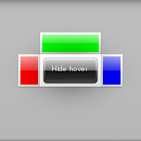
On this example we are going to have a button that when clicked will show our hover widget, this hover will have content set on it's left, top, right and middle positions. In the middle position we are placing a button that when clicked will hide the hover. We are also going to use a non-default theme for our hover. We won't explain the functioning of button for that see Button.
We start our example with a couple of callbacks that show and hide the data they're given(which we'll see later on is the hover widget):
static void
{
}
#define EINA_UNUSED
Used to indicate that a function parameter is purposely unused.
Definition: eina_types.h:339
EVAS_API void evas_object_show(Evas_Object *eo_obj)
Makes the given Evas object visible.
Definition: evas_object_main.c:1814
Efl_Canvas_Object Evas_Object
An Evas Object handle.
Definition: Evas_Common.h:185
static void
{
}
EVAS_API void evas_object_hide(Evas_Object *eo_obj)
Makes the given Evas object invisible.
Definition: evas_object_main.c:1823
In our main function we'll do some initialization and then create 3 rectangles, one red, one green and one blue to use in our hover. We'll also create the 2 buttons that will show and hide the hover:
EAPI_MAIN int
{
Evas_Object *win, *bt, *bt2, *rect, *rect2, *rect3, *hover;
elm_object_text_set(bt, "Show hover");
elm_object_text_set(bt2, "Hide hover");
#define EINA_TRUE
boolean value TRUE (numerical value 1)
Definition: eina_types.h:539
Eina_Bool elm_policy_set(unsigned int policy, int value)
Set a new policy's value (for a given policy group/identifier).
Definition: elm_main.c:1380
@ ELM_POLICY_QUIT_LAST_WINDOW_CLOSED
quit when the application's last window is closed
Definition: elm_general.h:248
@ ELM_POLICY_QUIT
under which circumstances the application should quit automatically.
Definition: elm_general.h:227
Evas_Object * elm_win_util_standard_add(const char *name, const char *title)
Adds a window object with standard setup.
Definition: efl_ui_win.c:9582
void elm_win_autodel_set(Eo *obj, Eina_Bool autodel)
Set the window's autodel state.
Definition: efl_ui_win.c:6194
EVAS_API void evas_object_color_set(Evas_Object *obj, int r, int g, int b, int a)
Sets the general/main color of the given Evas object to the given one.
Definition: evas_object_main.c:2024
EVAS_API void evas_object_move(Evas_Object *obj, Evas_Coord x, Evas_Coord y)
Move the given Evas object to the given location inside its canvas' viewport.
Definition: evas_object_main.c:1171
EVAS_API Evas * evas_object_evas_get(const Eo *eo_obj)
Get the Evas to which this object belongs to.
Definition: evas_object_main.c:2662
EVAS_API void evas_object_resize(Evas_Object *obj, Evas_Coord w, Evas_Coord h)
Changes the size of the given Evas object.
Definition: evas_object_main.c:1236
EVAS_API void evas_object_size_hint_min_set(Evas_Object *obj, Evas_Coord w, Evas_Coord h)
Sets the hints for an object's minimum size.
Definition: evas_object_main.c:2611
EVAS_API Evas_Object * evas_object_rectangle_add(Evas *e)
Adds a rectangle to the given evas.
Definition: evas_object_rectangle.c:78
With all of that squared away we can now get to the heart of the matter, creating our hover widget, which is easy as pie:
Evas_Object * elm_hover_add(Evas_Object *parent)
Adds a hover object to parent.
Definition: elm_hover.c:685
Having created our hover we now need to set the parent and target. Which if you recall from the function documentations are going to tell the hover which area it should cover and where it should be centered:
elm_hover_target_set(hover, bt);
void elm_hover_parent_set(Evas_Object *obj, Evas_Object *parent)
Sets the parent object for the hover.
Definition: elm_hover.c:757
Now we set the theme for our hover. We're using the popout theme which gives our contents a white background and causes their appearance to be animated:
Eina_Bool elm_object_style_set(Evas_Object *obj, const char *style)
Set the style to used by a given widget.
Definition: elm_main.c:1583
And finally we set the content for our positions:
void elm_object_part_content_set(Evas_Object *obj, const char *part, Evas_Object *content)
Set the content on part of a given container widget.
Definition: elm_main.c:1562
So far so good? Great 'cause that's all there is too it, what is left now is just connecting our buttons to the callbacks we defined at the beginning of the example and run the main loop:
return 0;
}
#define ELM_MAIN()
macro to be used after the elm_main() function
Definition: elm_general.h:556
void elm_run(void)
Run Elementary's main loop.
Definition: elm_main.c:1357
EVAS_API void evas_object_smart_callback_add(Evas_Object *eo_obj, const char *event, Evas_Smart_Cb func, const void *data)
Add (register) a callback function to the smart event specified by event on the smart object obj.
Definition: evas_object_smart.c:1040
Our example will initially look like this:
And after you click the "Show hover" button it will look like this:

