PieMenuStyle QML Type
Provides custom styling for PieMenu. More...
| Import Statement: | import QtQuick.Controls.Styles 1.4 |
| Since: | Qt 5.5 |
Properties
- background : Component
- backgroundColor : color
- cancel : Component
- cancelRadius : real
- control : PieMenu
- endAngle : real
- menuItem : Component
- radius : real
- selectionColor : color
- shadowColor : color
- shadowRadius : real
- shadowSpread : real
- startAngle : real
- title : Component
Methods
- real sectionCenterAngle(int itemIndex)
- real sectionEndAngle(int itemIndex)
- real sectionStartAngle(int itemIndex)
Detailed Description
PieMenuStyle is a style for PieMenu that draws each section of the menu as a filled "slice".
You can create a custom pie menu by replacing the following delegates:
To customize the appearance of each menuItem without having to define your own, you can use the backgroundColor and selectionColor properties. To customize the drop shadow, use the shadowColor, shadowRadius and shadowSpread properties.
Icons that are too large for the section that they are in will be scaled down appropriately.
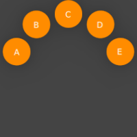
To style individual sections of the menu, use the menuItem component:
 PieMenuStyle {
     shadowRadius: 0

     menuItem: Item {
         id: item
         rotation: -90 + sectionCenterAngle(styleData.index)

         Rectangle {
             width: parent.height * 0.2
             height: width
             color: "darkorange"
             radius: width / 2
             anchors.right: parent.right
             anchors.verticalCenter: parent.verticalCenter

             Text {
                 id: textItem
                 text: control.menuItems[styleData.index].text
                 anchors.centerIn: parent
                 color: control.currentIndex === styleData.index ? "red" : "white"
                 rotation: -item.rotation
             }
         }
     }
 }

Property Documentation
background : Component |
The background of the menu.
By default, there is no background defined.
backgroundColor : color |
The background color.
cancel : Component |
The cancel component of the menu.
This is an area in the center of the menu that closes the menu when clicked.
By default, it is not visible.
endAngle : real |
The angle (in degrees) at which the last menu item will be drawn.
The absolute range formed by startAngle and endAngle must be less than or equal to 360 degrees.
Menu items are displayed clockwise when startAngle is less than endAngle, otherwise they are displayed anti-clockwise.
See also startAngle.
menuItem : Component |
This component defines each section of the pie menu.
This component covers the width and height of the control.
No mouse events are propagated to this component, which means that controls like Button will not function when used within it. You can check if the mouse is over this section by comparing control.currentIndex to styleData.index.
Each instance of this component has access to the following properties:
readonly property int styleData.index | The index of this menu item. |
readonly property bool styleData.hovered | true if this menu item is under the mouse. |
readonly property bool styleData.pressed | true if the mouse is pressed down on this menu item. |
[read-only] radius : real |
The distance from the center of the menu to the outer edge of the menu.
See also cancelRadius.
selectionColor : color |
The selection color.
shadowColor : color |
The shadow color.
See also DropShadow.
shadowRadius : real |
The shadow radius.
See also DropShadow.
shadowSpread : real |
The shadow spread.
See also DropShadow.
startAngle : real |
The angle (in degrees) at which the first menu item will be drawn.
The absolute range formed by startAngle and endAngle must be less than or equal to 360 degrees.
Menu items are displayed clockwise when startAngle is less than endAngle, otherwise they are displayed anti-clockwise.
See also endAngle.
title : Component |
The component that displays the text of the currently selected menu item, or the title if there is no current item.
The current item's text is available via the styleData.text property.
Method Documentation
Returns the center of the section at itemIndex as an angle in degrees.
Returns the end of the section at itemIndex as an angle in degrees.
Returns the start of the section at itemIndex as an angle in degrees.