Note
Go to the end to download the full example code.
Pie charts#
Demo of plotting a pie chart.
This example illustrates various parameters of pie.
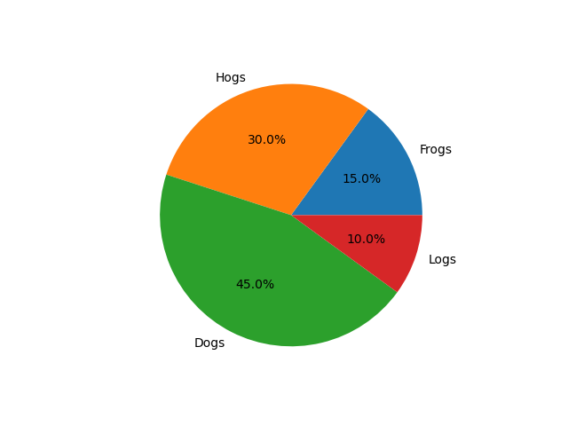
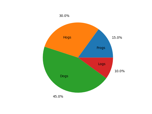
Label slices#
Plot a pie chart of animals and label the slices. To add labels, pass a list of labels to the labels parameter
import matplotlib.pyplot as plt

labels = 'Frogs', 'Hogs', 'Dogs', 'Logs'
sizes = [15, 30, 45, 10]

fig, ax = plt.subplots()
ax.pie(sizes, labels=labels)
Each slice of the pie chart is a patches.Wedge object; therefore in
addition to the customizations shown here, each wedge can be customized using
the wedgeprops argument, as demonstrated in
Nested pie charts.
Auto-label slices#
Pass a function or format string to autopct to label slices.
fig, ax = plt.subplots()
ax.pie(sizes, labels=labels, autopct='%1.1f%%')
By default, the label values are obtained from the percent size of the slice.
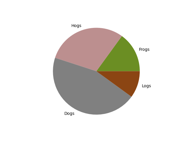
Color slices#
Pass a list of colors to colors to set the color of each slice.
fig, ax = plt.subplots()
ax.pie(sizes, labels=labels,
       colors=['olivedrab', 'rosybrown', 'gray', 'saddlebrown'])
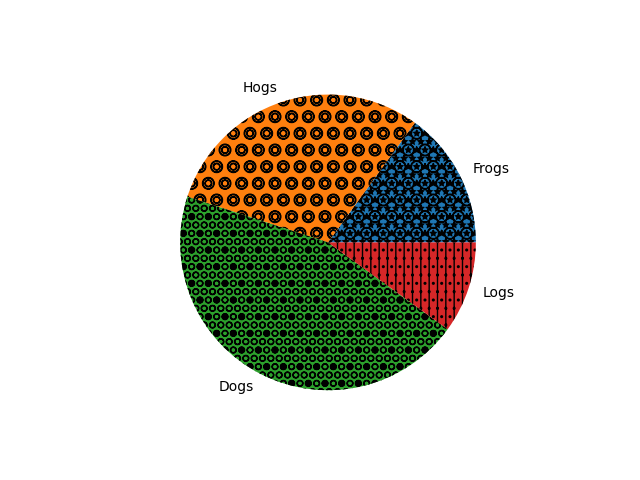
Hatch slices#
Pass a list of hatch patterns to hatch to set the pattern of each slice.
fig, ax = plt.subplots()
ax.pie(sizes, labels=labels, hatch=['**O', 'oO', 'O.O', '.||.'])
Swap label and autopct text positions#
Use the labeldistance and pctdistance parameters to position the labels and autopct text respectively.
fig, ax = plt.subplots()
ax.pie(sizes, labels=labels, autopct='%1.1f%%',
       pctdistance=1.25, labeldistance=.6)
labeldistance and pctdistance are ratios of the radius; therefore they
vary between 0 for the center of the pie and 1 for the edge of the
pie, and can be set to greater than 1 to place text outside the pie.
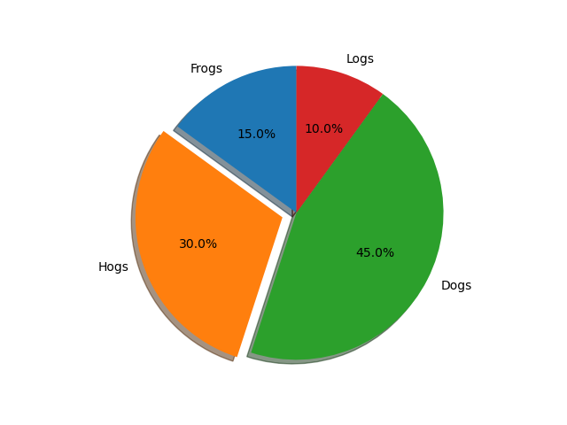
Explode, shade, and rotate slices#
In addition to the basic pie chart, this demo shows a few optional features:
offsetting a slice using explode
add a drop-shadow using shadow
custom start angle using startangle
This example orders the slices, separates (explodes) them, and rotates them.
explode = (0, 0.1, 0, 0)  # only "explode" the 2nd slice (i.e. 'Hogs')

fig, ax = plt.subplots()
ax.pie(sizes, explode=explode, labels=labels, autopct='%1.1f%%',
       shadow=True, startangle=90)
plt.show()
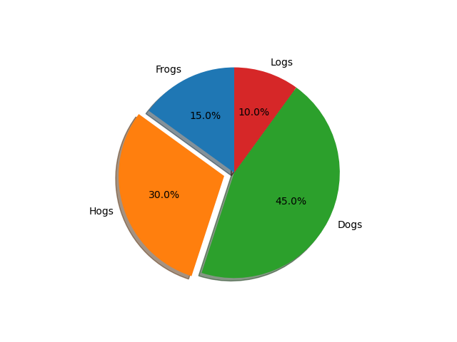
The default startangle is 0, which would start the first slice ("Frogs") on
the positive x-axis. This example sets startangle = 90 such that all the
slices are rotated counter-clockwise by 90 degrees, and the frog slice starts
on the positive y-axis.
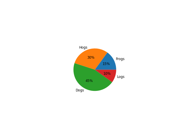
Controlling the size#
By changing the radius parameter, and often the text size for better visual appearance, the pie chart can be scaled.
fig, ax = plt.subplots()

ax.pie(sizes, labels=labels, autopct='%.0f%%',
       textprops={'size': 'smaller'}, radius=0.5)
plt.show()
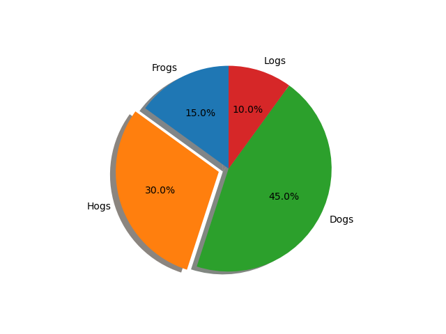
Modifying the shadow#
The shadow parameter may optionally take a dictionary with arguments to
the Shadow patch. This can be used to modify the default shadow.
fig, ax = plt.subplots()
ax.pie(sizes, explode=explode, labels=labels, autopct='%1.1f%%',
       shadow={'ox': -0.04, 'edgecolor': 'none', 'shade': 0.9}, startangle=90)
plt.show()
References
The use of the following functions, methods, classes and modules is shown in this example: